Become A Better Blogger - Our Easiest and Most Affordable Website Redesign

Published: Mon, 01/19/15

I'm sorry I didn't email you last week. Last Sunday night I was preoccupied... because the next day we were launching our new blog design.
 
And since we were taking a low-budget approach to the upgrade, the designer was going to be making the changes on the LIVE site! 
 
It went really well and our site was only offline for a few hours. I spent the rest of the night fixing up the sidebars and setting up widgets etc. I was still tweaking things for the following few days, but I think we're now officially set with our new look.
 
I shared a quick post about the upgrade - including a look at the old design in case you've forgotten it.
 
But, for you... a regular reader of our "Become a Better Blogger" series... I'll go deeper into the steps we took - including the mistakes we made and the money we saved. 
 
And I'll even tell you exactly how to set up and customize the social share icons that look like those on mashable.com.
 
Trends and Procrastination
 
I've never been perfectly happy with our site's design. Our very first version of 5MinutesForMom.com, I installed and "designed" myself. It was good enough compared to what most other blogs looked like in 2006.
 
Through the years we've had a couple of redesigns and I've been moderately pleased with the results, but the process was always long and cost a fair amount.
 
Our latest design had been driving Janice and I crazy for a long time. Trends had changed and we knew we needed an update, but we put it off.
 
Many of our blogging friends were having their sites designed from scratch by expensive designers with 6 month waiting lists. (Yes, we were jealous. LOL)
 
A Failed Attempt
 
We'd known for a long time that we wanted to move to the Genesis framework. Our last design was in Thesis and it's harder to find people to help with updates and small design changes with Thesis.
 
So I spent a long time looking at all the various StudioPress themes and decided that the Daily Dish theme would work. 
 
I hired a developer for $150 on Freelancer.com to install and customize the Daily Dish theme on a development version of our site.
 
He did the job as requested, but I did not like the result. It just wasn't what I wanted.
 
Asking Friends
 
I turned to my friends for referrals. One of the recommendations was for Lauren of Restored 316 Designs.
 
I visited her site and fell in love.
 
It was the match of femininity with simplicity that we needed.
 
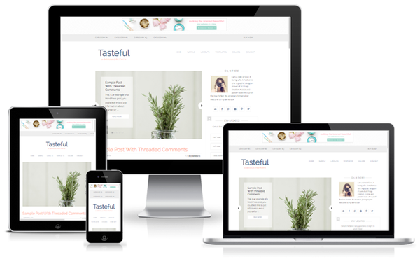
We picked the Tasteful Theme and decided to purchase her Sparkle & Shine package for $700 so that she would do the install and the customizations.
 
(Although I would say you could easily do the install and customizations yourself, I just wanted to have her get it done correctly and quickly for us.)
 
Colors
 
While I love the set of color choices Lauren offers with the Tasteful package, I wanted to tweak them to match our logo exactly.
 
Have you used Design-Seeds.com before? Caution... you can spend HOURS there. I browsed for an entire night, looking at color schemes that were similar to our existing logo. 
 
I was inspired by this set of colors and our final set incorporated some of these with a couple slight differences. 
 
We sent Lauren the colors we wanted to use and she changed the template for us when she did the install. I set up and arranged many of the sidebar widgets myself and those changes were very simple.
 
The result is a modern, clean and simple layout that allows our content to take the main stage... and basically it was only a $50 theme. (Yes, I paid extra for the install and setup because I was scared of messing up our site.)
 
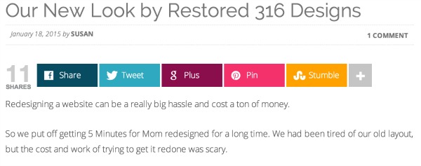
If you'd like to get your blog freshened up, click through to Restored 316 Designs now. And yes, that's an affiliate link... if you use her designs, make sure you sign up for an affiliate account as well and spread the word. I love to see an awesomely talented woman like Lauren wildly succeed.
 
 
Social Sharing Icons

One major decision we still had to make was what social sharing icons we should use. 

I spent hours browsing blogs and noticing what icons they used, and I finally decided to follow the big boys at Mashable.com and use the Mashshare icons.

I thought it was a free plugin... because it is... only it isn't... if you want more than Facebook and Twitter. I discovered that important detail after I'd installed the free version.

But since it only cost 18 Euro, I decided to just pay up and get the Add-on.

The trouble was then our site was dominated by the standard colors of the social share buttons. 

I decided to customize the colors.

After a little research, I figured out how to do it. Changing the background colors of the buttons to our 5minutesformom color set was simple. 

In the Mashshare settings, on the Visual tab, in the Visual Style & Template, in the Custom CSS section, I placed the following code...

.mashicon-facebook {
background: #084C61;
}

.mashicon-twitter {
background: #2EA9BF;
}

.mashicon-google {
background: #8A0E4C;
}

.mashicon-pinterest {
background: #F5316C;
}

.mashicon-stumbleupon {
background: #FFA200;
}

You could set the button background colors to anything you want.


I'm thrilled to finally have a new look and I can't believe how quick, easy and affordable it was.

Thanks Lauren!

Did You Miss Anything?

If you’re new here, you’ll definitely want to catch up…

What Do You Want To Know?

What would you like me to cover next week? Shoot me back a quick reply and let me know.

Talk soon,

Susan (and Janice)
5 Minutes For Mom

ps. To tell your friends about this "Become a Better Blogger" email series, you can send them here.