IMPORTANT ANNOUNCEMENT: Due to the likelihood of a snowstorm here and a potential loss of power and internet service, we're post-poning our YouTube Live Chat to the 4th Sunday, January 23, at the usual time, 2 p.m. Eastern. Hope you can join us
then.
We all know the difference between strolling in an unfamiliar territory randomly and having a path to follow. A painting needs a path to assure that a viewer sees it as a whole. We painters guide the
eye of every single viewer of our works, whether or not they realize their eyes are being guided. Notice the difference in how your eyes behave when you look at this...
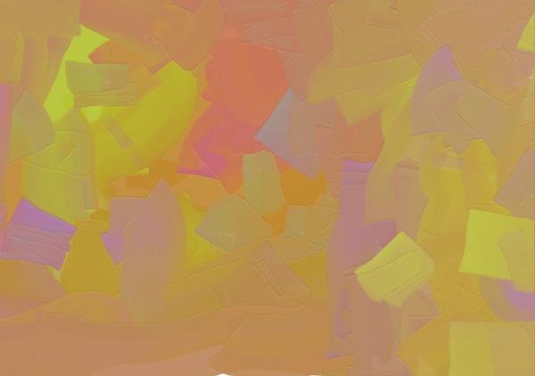
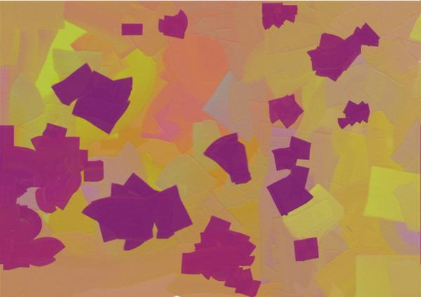
The structural difference in these two designs is that the bottom one includes shapes of strong value contrast whereas the shapes of the top piece have very little value
contrast. Instead, in the top one, the higher saturation of yellow plays the role of eye-guide in a subtle triangular direction. But in the bottom design, with that high saturation still there, the dark shapes get more attention, and guide your eye throughout the design in a circular direction--a circular path.
A path is a line of movement guiding you somewhere. A visual path is a line of movement created by emphasis. Emphasis is created by calling attention to
something. In the second design above, the emphasis is caused by the strong value contrast, therefore calling our attention to it.
How we arrange what we are emphasizing creates a visual path. Value contrast is the compositional tool used in our example, guiding the eye in that circular
path.
HOW THE ELEMENTS ARE WORKING
In our language of painting series, we looked at the role of each of the elements. In our two designs here, we see the color, value, shape and direction playing their major
roles. In both designs, the same shape repeats itself in variations throughout. Each design is kept in harmony by containing a dominance of analogous hues. Those hues vary in saturation. In the bottom design, value uses its ability to contrast strongly to guide our eyes in a particular direction.
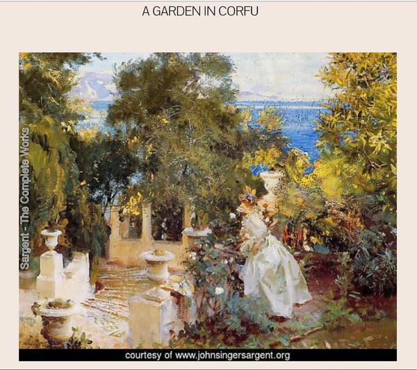
Look at this Sargent painting. Locate the direction in which he guides your eye with strong value contrast.
During my Language of Painting series, I explained the role of our visual elements. If you'd like to review those roles, here are the links
to each of those discussions: Color --Value -- Shape -- Texture -- Size -- Line and Direction
Have yourself a spectacular weekend!
You can access the archive of all my newsletters at anytime by going HERE. |