Continuing my Language of Painting series, this one looks at Value. If you'd like to review part 1 on Color, go HERE.
We all know that values in painting are the lights and darks. But value plays the most important role of any of the visual elements--it enables
all the others to be visible!
To accomplish this task, value can do only two actions--it can contrast and it can gradate. It is the degree to which it
performs these actions and the way it combines them that makes a painting work.
Contrast means two things are different, so for value to contrast, there have to be at least two values. Artists from centuries ago discovered that these
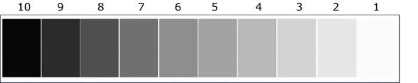
contrasts happen in degrees, so to help understand the relationship of those degrees, somebody invented a value scale, giving each value in the scale a number.
(Side Bar--Early value scales showed only five values with the darkest numbered 5 and the lightest numbered 1. Then the 7-value
scale appeared, then variations popped up here and there as art and science gurus messed around with it, until the 10-value scale emerged. Somebody decided that its numbers ought to be set according to percentages of light and so they set 10 as the lightest to represent 100% light. Others, like myself who have spent a lifetime perceiving the highest of those numbers as the darkest dark, felt that number 10 should be the darkest,
dark.)
BACK TO WHAT VALUE CAN DO...
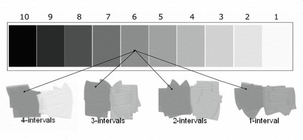
Forget about the scale debate, what we do detect in the 10-value scale are the degrees with which value can contrast. The difference
between side by side values on the scale show an interval, and it's those intervals that cause the degree of contrast.
So a single value can contrast with another one very little or a whole lot, depending upon the number of
intervals between the two. Above we see value 6 appear with value 2, then value 3, then value 4, and then value 5. I have shown you the number of intervals between each of these. The strongest possible contrast, then is between 1 and 10--9 intervals.
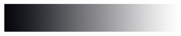
To gradate means to gradually change from one thing to another, so the value scale in gradation looks like this:
Gradations can happen between intervals of any number, so a slight value gradation would be one where the intervals between the darkest and the
lightest ends of the gradation are close. The more intervals between the values, the stronger the gradation.
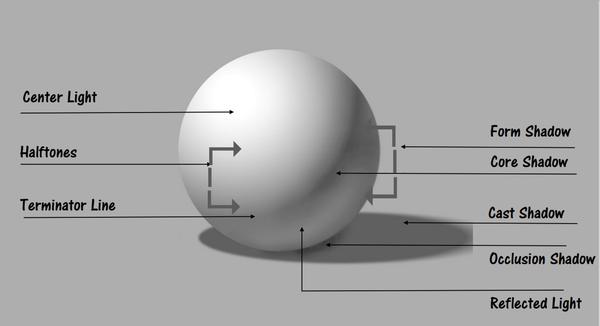
The miracle of value's role is caused by how light rays hit surfaces. Where there are no light rays, we see value 10, where they are the
strongest, we see value 1.
So when looking at value areas and using the language of painting to communicate their essence, the painter asks: What is the value doing? Is it
contrasting? Is it gradating? Where does it register on the scale? Remember, the doing is contrasting or gradating or sometimes both together, and it is how we see and use these actions that creates the magic value can work in our paintings!
I hope you will join me tomorrow (November 21) at 2 p.m. Eastern for our monthly YouTube Live Chat. The topic will be Working with Value Fields! To join in, go HERE to our Channel Page. Look for the live session. Some of you might need to click on Community to find it.
Have yourselves a delightful weekend!
You can access the archive of all my newsletters at anytime by going HERE. |