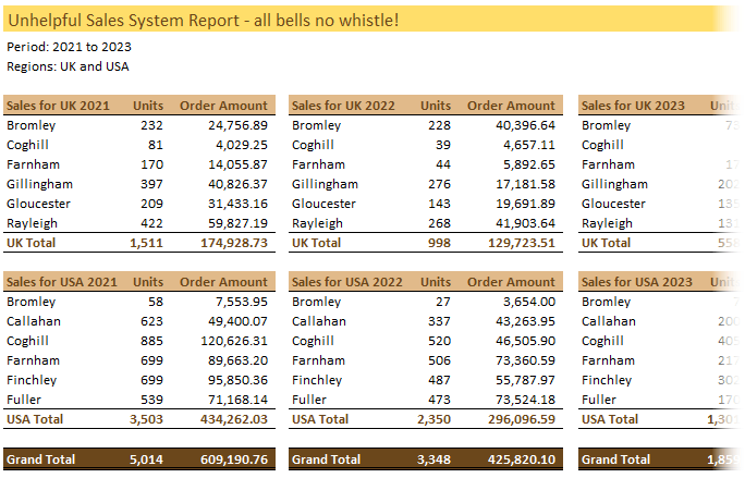
1. The Semi-report
A semi-report is data that has had some degree of summarising already applied.
Like in the example below we can see that the data has been summarised into regions (UK and USA) as these have their own column labels:
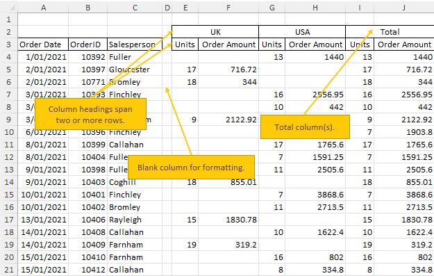
Signs of a semi-report (some or all of these will be present):
- Column labels are on two rows.
- Column(s) for Totals.
- Columns for time periods (weeks, months, years) or other grouping of data.
- Blank rows or columns.
- Rows containing subtotals and or a Total.
What’s wrong with a Semi-report:
- You can’t use this data in a PivotTable because a PivotTable can’t have blank columns or duplicate column labels, and column labels must be on one row only. In the semi-report above row 3 has ‘units’ and ‘order amount’ repeated. Note: this can be fixed with a Flat Data table – more on that below.
- You can’t easily change the way the data is summarised. For example what if
your boss wanted you to change the view so that it was summarised by year like the example below?
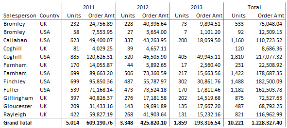
You can do this in a PivotTable in seconds when your source data is in a tabular format but it’s not as easy when it’s in a semi-report format…I’m not saying it’s impossible, it’s just more complicated than it needs to be.
2. Flat Data Table
A flat data table is similar to a semi-report in that it has some degree of summarisation already applied, however it
doesn’t have blank columns or column labels on two rows, which means you can use the data in a PivotTable report.
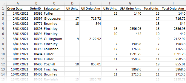
Signs of a Flat Data Table
- Column labels are on one row.
- Columns for time periods (weeks, months, years) or other summary levels like regions, departments etc.
- No blank rows or columns.
- No rows
containing subtotals and or a Total.
While the flat data table can be used in a PivotTable, it still has limitations because there is already a degree of summarisation in the data.
That is; there is a limit to how much you can manipulate the data in your PivotTable. For example, you can’t create the PivotTable
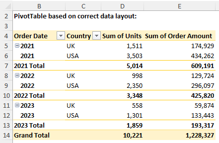
report below using the Flat Data table above, but you can when your data is in the correct format:
Note: you could use some complicated formulas to summarise the flat data table into the above report format, but why make your life difficult when there's an easier way?
3. Report Format
The worst type! Often 3rd party systems attempt to ‘help’ by providing you with a series of default reports, all nicely formatted of
course!
Unfortunately these reports often fall short of what you actually need and manipulating them into a format so that you can further analyse the data can be time consuming.
If you have a system that spits out data in a report format and you end up spending hours manipulating it to get what you actually need, find out if there is a way to get the underlying transactional data out of the system and import it into Excel.
Rest assured it’ll be there
(after all it’s creating reports for you from this very data), you just have to find a way to get it out.
Then you can use the tools God gave you, I mean Microsoft gave you and wield your Excel magic to get what you really want.
4. Data Entry Format
The data entry format gets its name due to the intuitive layout
which makes it easy for the person keying in the data.
However it doesn’t give any consideration to further analysis of the data.
This is perhaps the most frequent mistake I see people make and the one which I get the most questions from because people try to use functions they think should work, like SUMIF(S) and COUNTIF(S) etc.
However when your data is in the wrong format you can't use the built-in functions the way they were intended.
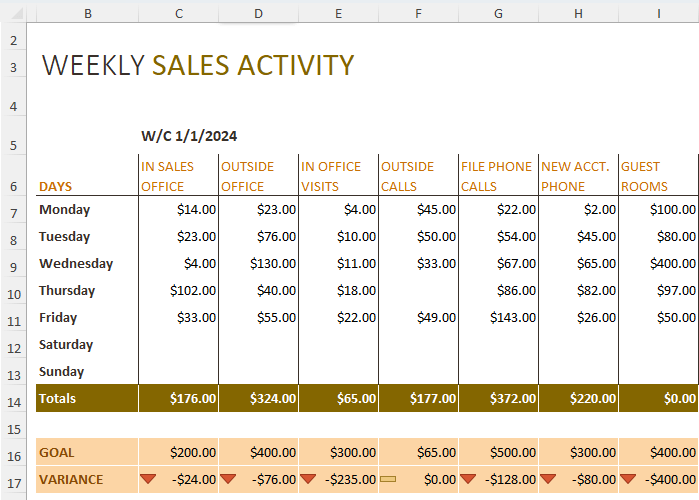
Just imagine this data tracks sales for each week of the year, that's 7 columns for every week! And your boss has asked you to tell them the total sales summarised by the sales categories in row 6.
You're looking at writing a lot of tedious, error prone formulas. However, if you'd recorded your data in the
correct format, you could create this report in a matter of seconds using a PivotTable or SUMIFS formulas.
5. Multi-Sheet or Multi-Workbook
This is where you have a separate worksheet (tab) or workbook (file) for each month, year, region, department, salesperson etc.
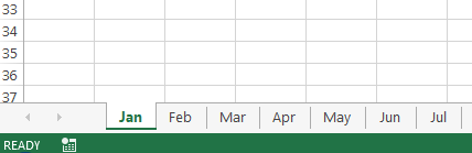
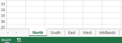
This is a back to front way to store your data because invariably you’ll want to summarise it, which is difficult to do when it's spread over multiple sheets. Whereas it’s easy to store your data in one sheet and then generate those separate sheets with the click of a couple of buttons.
Since Excel 2007 you
have more than 1 million rows to play with. Excel can handle a fair bit of data in one sheet. You are only making things difficult if you split it over multiple sheets or workbooks.
Instead, add a new column to your source/raw data sheet for the date/region/salesperson, whatever the category is that you have separate sheets for, and put the information from the tab name in the cells of your new column.
If you split it into multiple workbooks you cause even more problems for yourself and often end up with bloated files full of links to external places.
Tip: If your source data isn't going to change then you don't need a live link to it. Just bring the data into your analysis file as a value and analyse it from there, or use
Power Query to automatically get the data from the external files.
Excel Tabular Data - The Perfect Format
Ok, now that we've seen the pitfalls of
various data layouts, it's time to reveal the correct way to store your data in Excel. And that is to use a tabular layout:
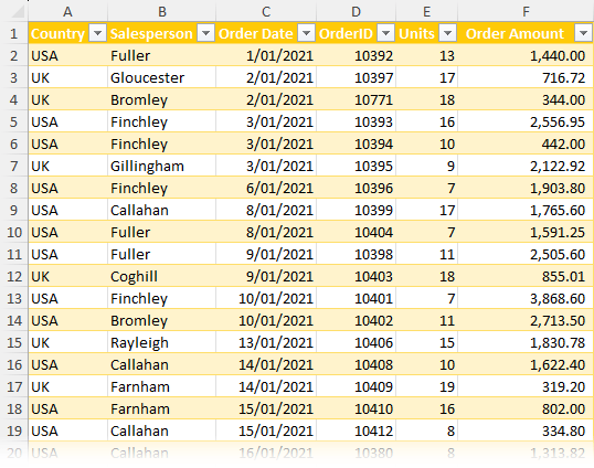
Tabular data is typically at a granular level of detail. Often transactional i.e. every row represents one transaction.
As is the case with the example above, where every row represents one order and has the related data for that order in a single row i.e. country, salesperson, units and amount.
When you start at this bottom
level of detail it’s easy to summarise or slice and dice your data into any number of combinations with PivotTables, SUMIFS, COUNTIFS etc.
But when you skip this step and start with data that has already been summarised it is much more difficult to change the summary format, and it often means you can’t use a lot of the built-in Excel tools and functions in the way they were intended.
This kills productivity and causes a lot of headaches that can easily be avoided if you just set your data up correctly from the outset.
The rules for tabular data:
- Every record is housed on one row.
- Each Column contains a type of data e.g. date, order number, quantity,
amount, salesperson, region etc.
- There are no blank columns or rows. Note: blank rows aren’t the end of the world, but they will make your life more difficult than it needs to be.
- Column labels are in one cell per column and located on the first row. Note: they don’t have to be on the first row, but they need to be in one row only. i.e. not split over
multiple rows and definitely no merged cells.
- There are no subtotals interspersed in the data.
Tabular Data Alternatives
Excel was designed to work with data in a tabular format. Tools like PivotTables and many of the functions work best with tabular data.
This is the format I recommend to my dashboard course members when building dashboards, because when your data is in a tabular format you can easily build dynamic reports that are quick to update.
However, I know that often you have no choice but to make it easy for people to perform data entry tasks which prevents you from using a tabular layout. Or maybe you have legacy systems that simply won’t provide the data in any other format than their predefined reports.
In which case, rather than wrangling formulas to work with unstructured data, you can use Power Query to convert it into the correct layout for reporting. That way you can boost productivity by using PivotTables and formulas the way they were intended.