Did you know there are currently five versions of Mosaic Moments alphabet dies? All have upper
and lowercase except Alphabet 1. All have numbers.
Alphabet 1 is a stenciled style. It is designed to be used as a block style letter. The upside: it each letter cuts one piece and is easy to place. There is no lowercase for this alphabet.
Alphabet 2 is a
versatile san-serif typeface. It doesn't make a big statement, but that is the point. It can work on almost any layout.
Alphabet 3 has a youthful personality. It is a great typeface for pages that are fun & lighthearted or kid related.
Alphabet 4 is a favorite serif
typeface. It's a classic storyteller that is ready to preserve memories of all kinds.
Alphabet 5 is a hybrid typeface with a strong personality. I really like the unexpected mix of letters with both angular and teardrop terminals. If you are looking for something modern,
Alphabet 5 is a great choice.
What you might like to know about Mosaic Moments Alphabet dies:
The capital sets are designed as 1x1 inch squares to fit the grid.
They are sized to look great on the grid, even if you choose not to use the square parts.
They come in multi-letter
strips so it's easier keep track of all the important letters.
Each alphabet set has a matching number set and matching lowercase sets are available for most.
Keep scrolling and take a look at the different ways our design team used Mosaic Moments alphabet and number dies on their pages.
Is there an alphabet
set you've had your eye on? Be sure to check your email this Friday! (More info below)
Have a you're-worth-it week!
Tami Potter
Have You Tried Alphabet 5 Dies?
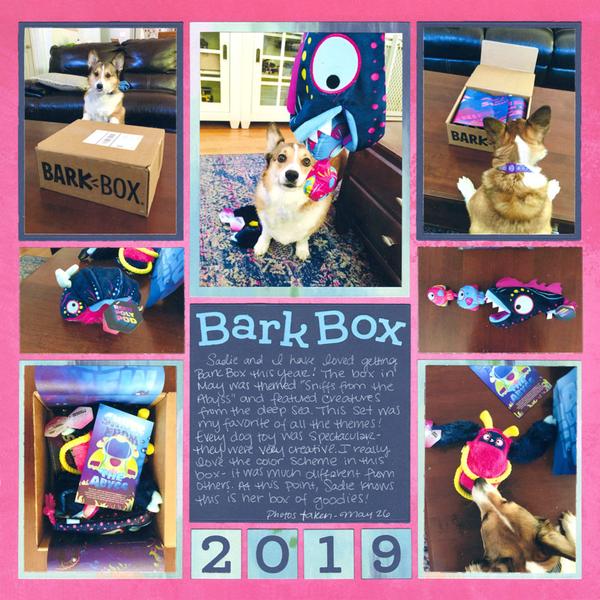
"Sniffs from the Abyss" by Paije Potter - Pattern #618
You can use the Alphabet 5 dies to make a page that's anything but basic.
Paije created this layout, and the Alphabet 5 dies are front and center. This font style provides classic looking letters as are the matching Numbers 5 dies. They can be strong and serious or soft and playful depending on how you style them and the theme of your layout.
Paije used the dies to spell out her title "Bark Box" in caps and lowercase. She placed the letters in a curving line which is a playful look. This fits with the theme of the layout like her
playful pup and the dog toys, "From the Abyss", imply. Paije also added the year with Numbers 5 in the bottom four 1x1 squares. Adding the year is a simple and easy way to place a journaling detail on the layout. The bold colors of the 12x12 Bikini Grid Paper and the ombre blue patterned paper paired with the sapphire card-stock really set off this layout and also make it extra modern and special.
Try using the Alphabet 5 Dies and Numbers 5 dies to create your exceptional pages.
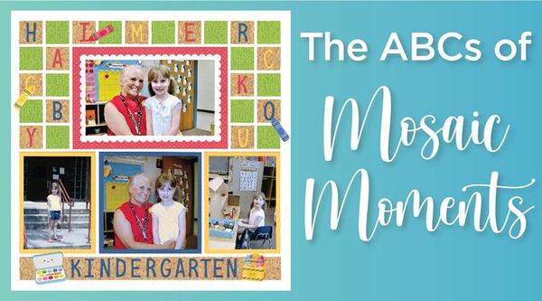
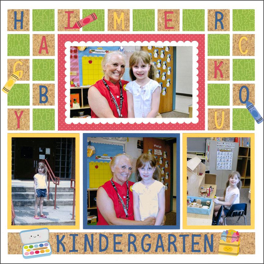
It's elementary that the Alphabet 3 Dies can be the star of impressive layouts.
Case in point, Paije's layout for her sister's favorite Kindergarten teacher. Paije used the Alphabet 3 dies on a
checkered pattern with cork and green lettered pattern paper. On top of the 1x1 cork patterned paper squares, she placed various primary colored letters from the Alphabet 3 CAPS set and added cute crayon stickers on some of the letters. This set of alphabet dies is perfect for a Kindergarten layout. It is fun and exciting with the subtle curves and bends in the letters. They add an innocent and special energy to your page. Paije adding the crayon
stickers to the letters implies a child could have drawn them, which adds an extra special element to her elementary school theme.
For the bottom strip: Paije took out her mat, ruler, and craft knife to hand cut a 1x10 strip of the cork patterned paper. This was the perfect spot to add the title in blue Alphabet 3 CAPS dies spelling out "KINDERGARTEN"
embellished with a couple of stickers. The placement of all the alphabet letters makes this layout frameable.
In the words of Sir Arthur Conan Doyle, "When you have eliminated the impossible, whatever remains, however improbable, must be the truth.” The truth is, you can create amazing layouts with the Alphabet 3 Dies.
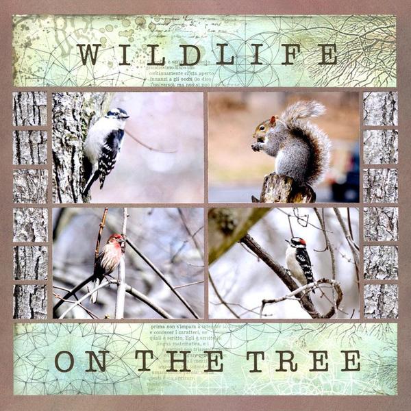
The simplest layouts made with only the Basic Die Bundle and Alphabet 4 dies, can be works of art.
Paije's layout uses the Basic Die Bundle with dies that fit the grid, hand-cut 2x10 grid
size pieces and Alphabet 4 dies. Paije cropped her four wildlife photos with the 3x4 die. To add texture to the layout, She added 1x1 squares of a close-up, tree bark critters. The tree bark mosaic border on each side of the page makes it look like there's a large tree in the background of the layout.
Then, Paije carefully selected the two
2x10 grid size pieces of pattern paper to use as places to put the title of the layout. She used the mat, craft knife, and cork backed metal ruler to make the 2.125x11.125 inch rectangles to fit the grid. She placed her title, made with the Alphabet 4 die and brown cardstock, in the center of those sections. The title stands out as the two 2x10 sections on the top and the bottom of the layout.
The Alphabet 4 dies have the look of a typewriter font and have a timeless appeal. Paije used all caps for a stronger look that matched the strength of the four one subject wildlife photos.
Paije created a beautiful work of art with the Alphabet 4 dies, and you can too!
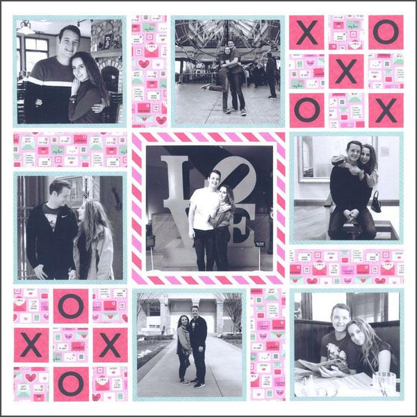
You can get super creative with the Alphabet 2 Dies to create pages you will love for many years to come.
Paije made this lovable layout with a cute design featuring the Alphabet 2 dies. With the One Inch Grid Die, she designed two
3x3 tic tac toe sections with two patterned papers cut into 1x1 squares. She placed the Alphabet 2 dies "X"s and "O"s on top of those squares, and that makes this layout so much more lovable.
Each tic tac toe section is unique. The top 3x3 section has the "X"s winning diagonally on the darker pink pattern paper. The bottom tic tac toe section has
no clear winner as the lighter pink pattern paper without "X"s and "O"s has the middle piece. Having the sections slightly different builds more interest for the whole layout.
All of her photos are cropped with the Layering Die Bundle dies. Her mats are cropped with the Basic Die Bundle dies that fit the
grid. Paije used all pattern paper except for the white center mat on her focal photo. Paije cut 1x3 strips with pattern paper to fill in the design spots near her photos to finish the spread. This spread is made with only basic dies, but it isn't "basic" looking!
The Alphabet 2 caps ("X" and "O") cut with black cardstock stand out on the pink pattern
paper and have two meanings. One, as a playful representation of the game tic tac toe. Two, as symbols for hugs and kisses - underscoring the love and affection of the couple.
Layouts made with the straightforward Alphabet 2 dies can be more complex, playful, and exciting than you imagined. Plus, they can make a page you will love
forever!
Never miss an important Mosaic Moments® sale again!
On your phone, text just the word JOIN to the number 833-264-2066,
and you'll be signed up to get a text message at the beginning of each snapncrop.com sale. You can stop receiving messages anytime by texting STOP. Message and data rates may apply.