Become A Better Blogger - 3 Simple Tricks for Choosing Colors and Fonts

Published: Mon, 01/26/15

I'm not an artist. Along with my lack of a singing voice, my inability to draw has always frustrated me.

So how do I create nice "pinnable" images for blog posts when I have no inherent artistic ability?

Here are my 3 tricks...

Look and Learn

I'm constantly watching, learning and being inspired by other images on Pinterest and other blogs. 

It's important not to copy someone else, but you can still notice what works and what doesn't.

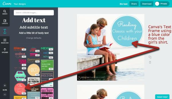
One of the easiest ways to see good examples and try out your own ideas is with canva.com

Canva still has some bugs and there are some features (such as resizing images) that I'd like to see added or changed, but it is overall a phenomenal tool.

Use the layouts and the text frames to give yourself a starting point and work from there.

In the example below, I've simply taken a stock photo, added one of canva's predesigned text frames and then changed the color of that frame to a blue color that matches the girl's shirt.
To get inspired, browse Pinterest boards that consistently have quality pins. You'll find tons of good examples that we've pinned on our Pinterest Boards here.

Also, as I mentioned last week, I love to get color inspiration from Design-Seeds.com. 

Pull the Colors and Plug them In

The easiest way to choose what colors to use for fonts and overlays in an image
is to pull a color from the photo.

There are many tools for grabbing the color code from an image or from anywhere on your screen, but since I always have PicMonkey open, I just use it. I open the image, add an overlay and then use the eyedropper tool to select a color from somewhere on the photo.

I don't think you can do this color selection from an image in Canva. (If you can, please let me know.)

(The free version of PicMonkey is great, but I regularly use the extra features in the paid version. It's very affordable at only $2.75 per month... especially considering I use it literally every day. If you want to sign up for PicMonkey Royale, click here for our affiliate link.)
Then once I have that hex color code, if I need a matching or contrasting color, I'll use a tool such as paletton.com and put in that color code as a starting point.

(A good photo is an important starting point. We use tons of stock photography because we don't have always have time to shoot and edit our own photos for every post. These days, my favorite place to get decent, affordable stock photos is dollarphotoclub.com. Yes, that's an affiliate link. Thanks!)


Stay Simple and Consistent 

Less is more.

Generally you should stick to 2 or 3 fonts on one image and 1, 2 or maximum 3 colors for those fonts.

One of the toughest things is to pair fonts... so learn from others. Canva is an awesome place to see what fonts pair well as they show you so many examples.

It's also a great idea to come up with a few font combinations that you like and then consistently use them on various images.

If your logo is font based like ours, you can incorporate those fonts. For example, our logo uses Century Gothic and Angelina, so we often use those fonts in our images.

In PicMonkey, you can select "Your Own Font" and use any font. In Canva you are limited to their selection of fonts... but being limited is often good. They've selected appealing fonts and given you examples of how to pair them. 

 
I hope these tips help you create more "pinnable" images. If you have any other suggestions or tools you use, I'd love to hear it.

You can also find many more tips and tutorials for using PicMonkey on our PicMonkey Resource Page.